
Information presented in the Project Center in Microsoft Project Online can sometimes be a mystery. The percent (%) complete metric is a great example of this. You’ll find it on the Gantt chart. The Gantt chart is a pictorial representation of a project’s lifecycle. It can be fairly simple and straight-forward and can be more complex, presenting variance from the project’s baseline, task dependencies, critical path, and more. Let’s zoom in on one of the main components of many Gantt charts, the progress bar, and its relationship to the project’s overall status.
I received a question today from a client.
Why, if my project manager is saying the project status is “green,” is the progress bar in the Gantt chart not aligned with today’s date?
Simple question, complex answer. Let’s go to Project and set up some sample data.
What the % Complete metric represents
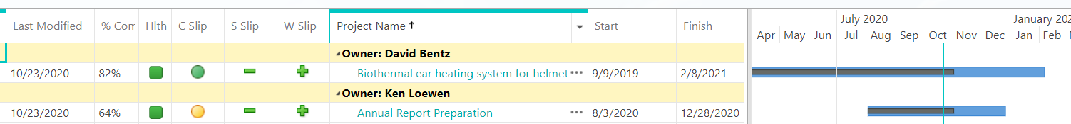
The image below shows two projects in my Project Online environment. I’ve updated it as if all of the tasks had been performed as scheduled by the PM. They started on time, completed on time, and the planned amount of work was performed in all cases. As a result, we might expect that the black progress bar within the blue project timeline should be precisely at the green vertical line representing today’s date. However, the progress bar on both projects extends beyond today. This could cause someone to think we’re ahead of schedule or performing work scheduled in the future.
Firstly, what is the source of the value for the progress bar? Great question. The progress bar represents the value of the project’s % Complete field. Microsoft’s online documentation for Project Online defines % Complete = Actual Duration / Duration * 100.
It’s all about Duration
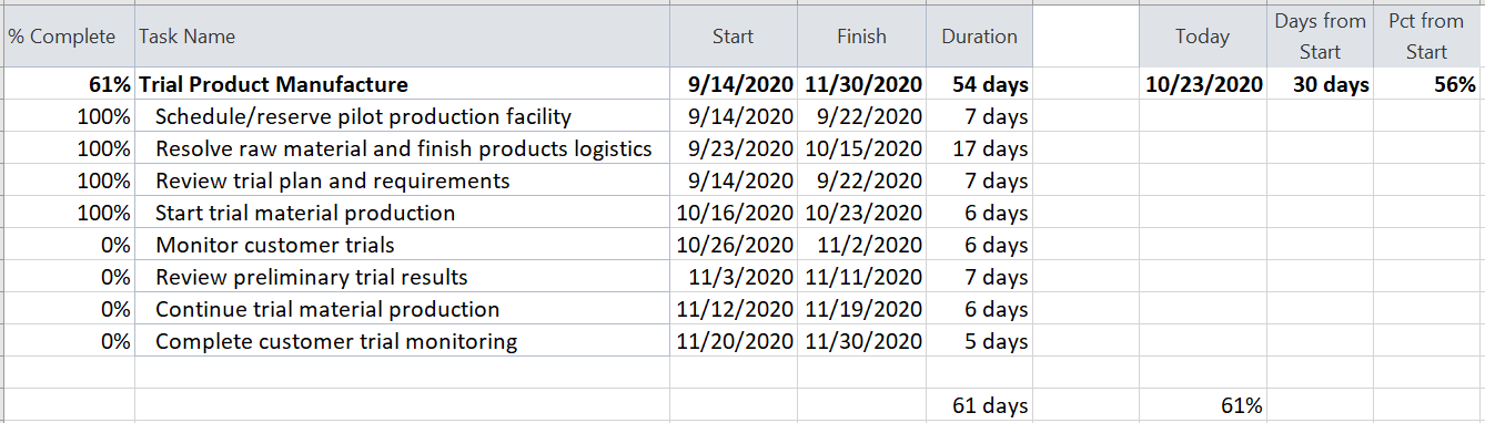
Below is a selection from our project schedule. You can see that the Trial Product Manufacture summary task’s overall duration is 54 working days. (In addition to the weekends, there are two non-working days in that period, representing Thanksgiving and the day after.) If you examine the start and finish dates of the detail tasks, you will see that two of the tasks overlap. This means there is work being performed on two tasks simultaneously during this period. If we add the duration of each of the detail tasks, we get a total of 61 days.
Next, we look at today (October 23rd). Today’s date is 30 working days from our Start date of September 14th. Therefore, today’s date, represented by the vertical green line on our Gantt chart, is 56% of the duration between our Start and Finish dates. Adding up the number of days of duration represented by the four 100% complete tasks gives us a total of 37 days. Dividing that into 61 days gives us 61% of progress for this summary task – putting the progress bar on our Gantt chart out to the right of our indicator for today.
Seems like a plausible explanation. What can we do to prove its validity? Let’s get rid of the overlap between those tasks and make the detail tasks follow one-behind-the other.
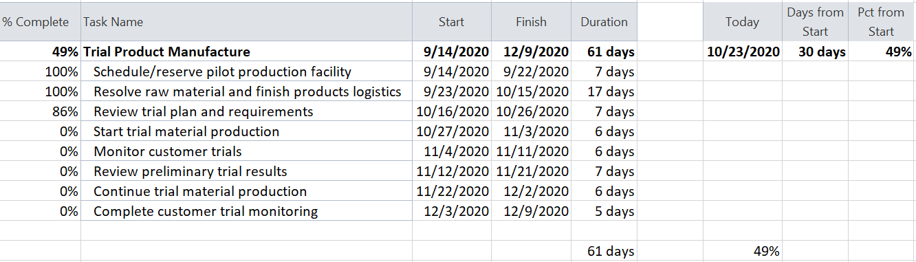
Our project schedule now shows that the overall duration has increased from 54 to 61 days because we no longer have two 7-day tasks overlapping. As a result, both the duration of the summary task and the sum of the duration of each detail task equals 61 days. The 30 days between today’s date and the Start Date is now 49% of the total duration, which agrees with the % Complete field in our project schedule.
What if Duration changes?
In another example, one of the two projects, still updated through today (though I’ve changed some other project data), appears to be significantly behind schedule.

I split one of the future tasks by inserting a significant break in the work schedule. Such as if you were unable to perform any work on that particular task for several weeks. You’ll see below that one of our tasks increased in overall duration from 6 to 53 days. The amount of work hasn’t changed; just the schedule for performing that work. As a result of making that change, my progress on this summary task dropped to 28%, and the progress bar on the Gantt chart is far shorter, indicating we have a longer duration.
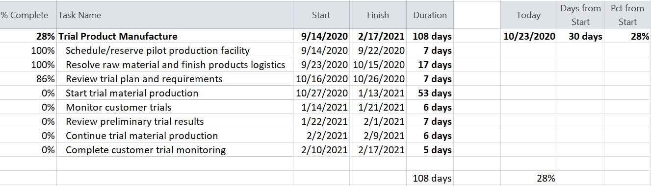
This set of tasks is only part of the overall project schedule. The degree of change we see here is far greater than in the overall project, whose duration has increased from 5 to 7½-months.
So, what’s the point of % complete?
In summary, the % Complete metric is influenced by the degree to which a project’s tasks either overlap or are spread out. Please understand that assigning more or fewer resources to project tasks can also influence this metric’s usefulness as an indicator of project progress.
What are our options, I hear you ask. Great question! The initial question was asked because % Complete is purely duration-based. It is a point-in-time indicator, and as a result, the presence of parallel workstreams limits the usefulness of that metric. Note that we are not saying the problem stems from work being unevenly scheduled. The amount of work being performed every day could be exactly equal or widely varying without impacting the situation we have just examined. We are also not saying the project is varying from its baseline because baseline also has no impact on % Complete.
Another metric available by default in Project Online (though not available for display in the out-of-the-box Project Center Gantt chart) is % Work Complete. Because it’s not available for use in the standard Gantt chart where the project’s overall duration provides it context, it should be presented with some complementary measure like Days from Start / Project Duration. Unlike the previous discussion where the steadiness of work assignments has no impact, it will directly impact % Work Complete and, for that reason, may also not be ideal.
Telling the whole story
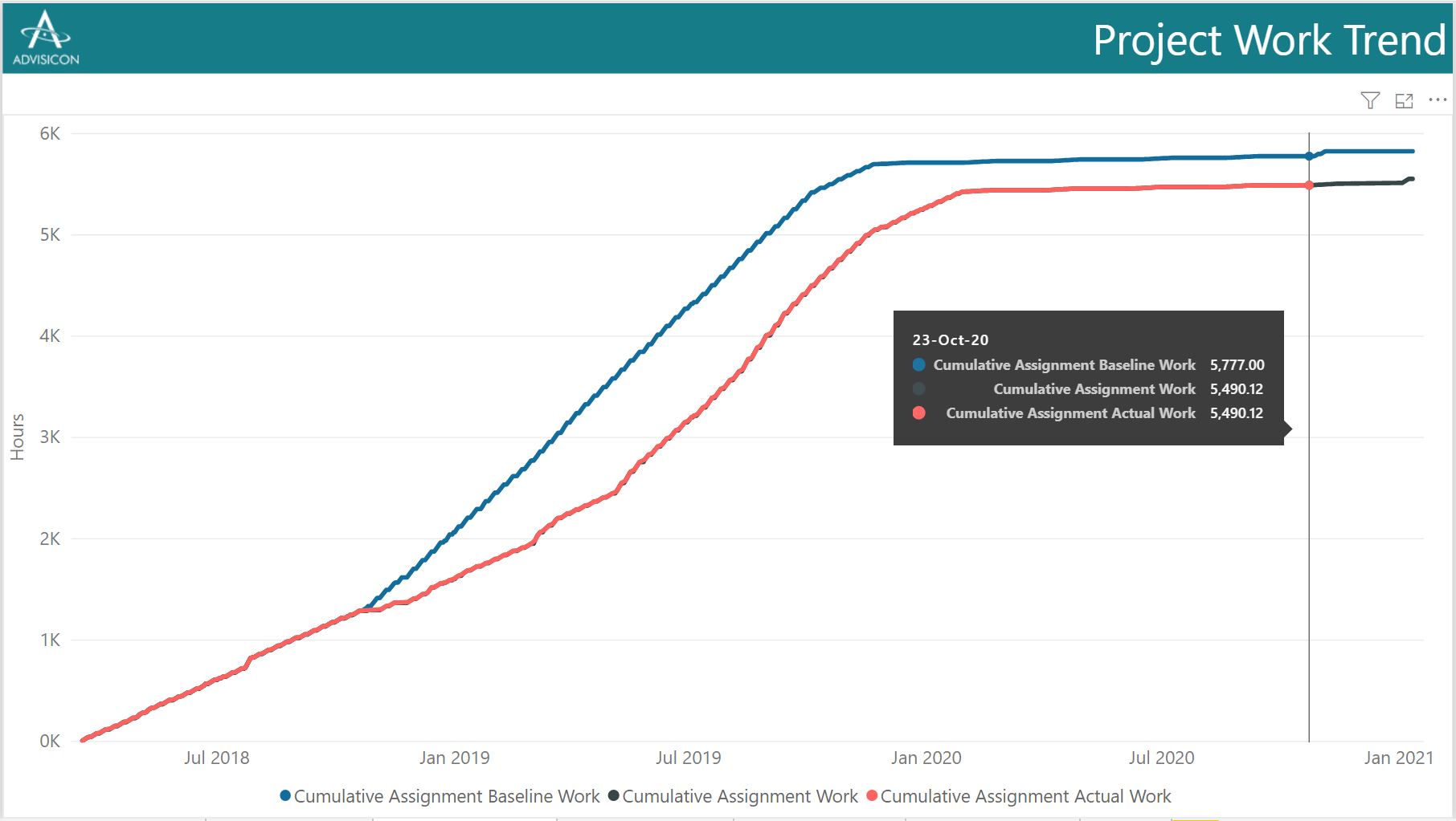
The Power BI report following shows the trend of work effort on the project over time. Some call it a Work Burn Up chart. It helpfully shows the baseline (plan of record) as a blue line, actual work-to-date as a red line, and the forecast based on the project schedule as a black line. Our tooltip shows us how close the work to-date is to the baseline. As the forecast and baseline don’t meet, we’re planning to complete the project with less effort than expected initially.
We also see that, in the 2nd half of 2018, the red line falls off to the right of the blue baseline because the pace of work decreased significantly relative to the baseline. It wasn’t until more than six months later that the pace of work returned to the planned pace. Moreover, this chart can be complemented by Cost Burn Up and Task Burn Up charts for a complete view of “here’s how the project was scheduled and here’s how it’s going.”
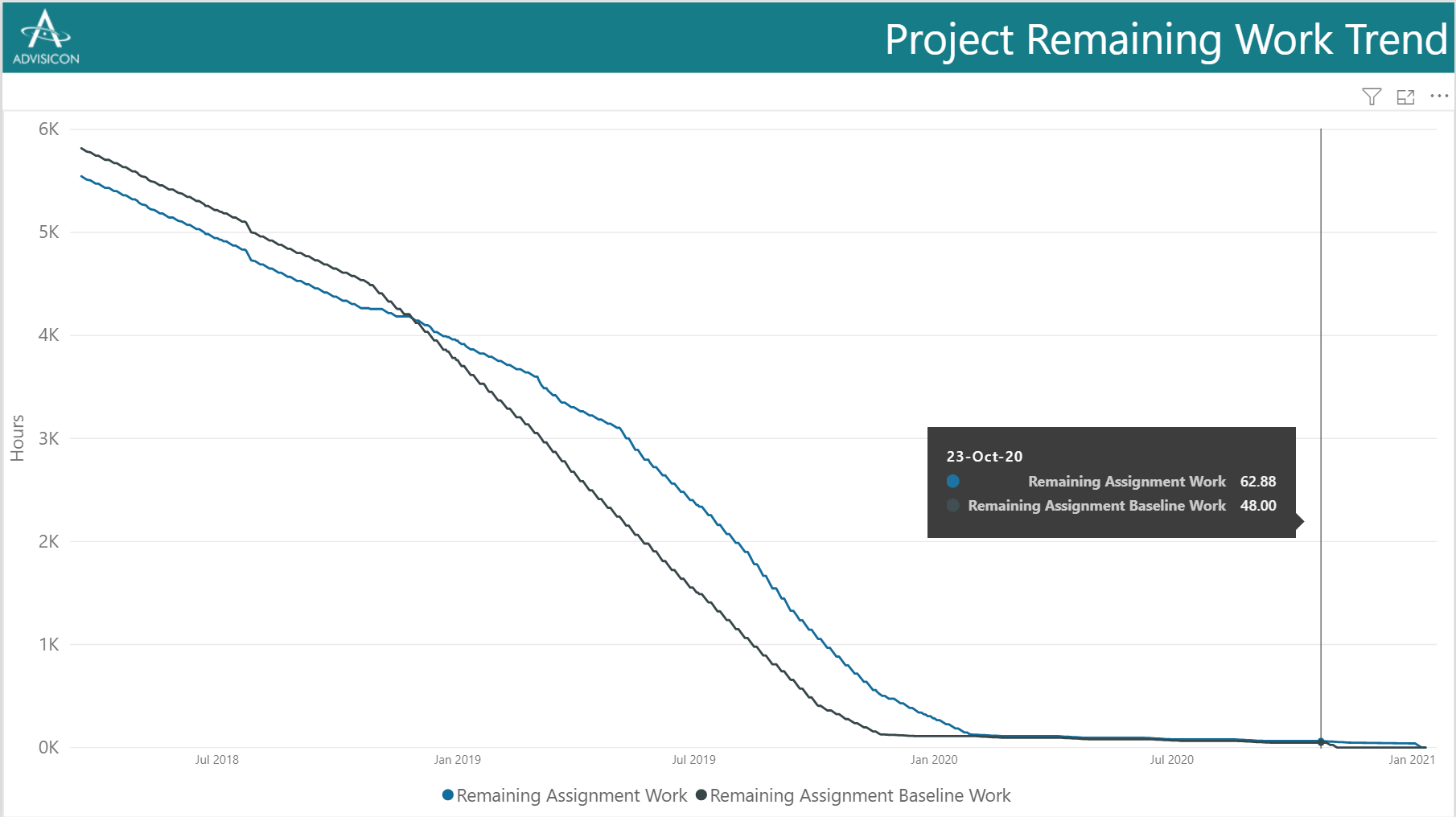
Counterparts to the burn up charts, called “burndown charts,” show the planned, actual, and forecast remaining values as they move toward zero at the project’s conclusion. The chart below is for the same project as of the same date.
Let us help you tell a better story
Are you and your stakeholders wrestling with reports, dashboards, and metrics that don’t actually tell you a story – or, worse, that tell you an inaccurate story?
Advisicon’s BI & Analytics team would love to develop and deploy more effective, accurate, insightful reports for project management or any other part of your organization. Our experts work with Power BI and project management organizations of all sizes to transform project delivery and produce superior results.
Start the conversation here.
